Brand Identity + Website Design
AXIS Identity System
A complete visual identity and website system for a real estate investment firm — built from a single skyline mark into a coherent world of print, signage, and digital presence..
Role
Brand Identity Designer, UI/UX Designer
Timeline
Three-week sprint, concept to launch
Tools
Figma
Framer
Adobe CC

About the project
Axis is a real estate investment firm helping clients buy, develop, and manage property with the confidence of a long-term partner rather than a transactional agency. Before this project, the brand had a generic skyline logo and no consistent visual language across its touchpoints.
Objective
Audience
Client problem
“We needed a complete brand identity that would build trust, create a consistent presence across social media and our website, and reflect the quality of our real estate business.”
Design challenge
Three tensions shaped the system from the first workshop
01
Design a mark distinct enough to anchor a premium brand, simple enough to scale from a favicon to a building sign.
02
Keep stationery, merchandise, signage, and digital all reading as one brand without a heavy guideline document.
03
Carry the same restraint and colour logic into a responsive product experience, not just a marketing skin.
Design process
From research to a finished interface, the work stayed deliberately sequential
01
Research
Competitive audit of investment and real estate brands; defined tone of voice and the visual territory to avoid.
02
Brand Strategy
Positioning around stability and growth shaped every decision that followed, from colour to layout.
04
Digital Presence
Social templates, signage, and merchandise applications to pressure-test the system in the real world.
05
Website Design
Responsive desktop and mobile interface translating the brand system into a usable product.
Primary design element
A mark built on a grid, not guessed


Construction logic
The horizon line became the bridge between market and skyline
Instead of stacking decorative motifs, the mark pairs an ascending triangle with a stepped skyline silhouette, unified by a single horizon arc. Proportions were locked to a grid before any colour or texture was added, so the mark holds up at favicon size and at building scale.
System in context
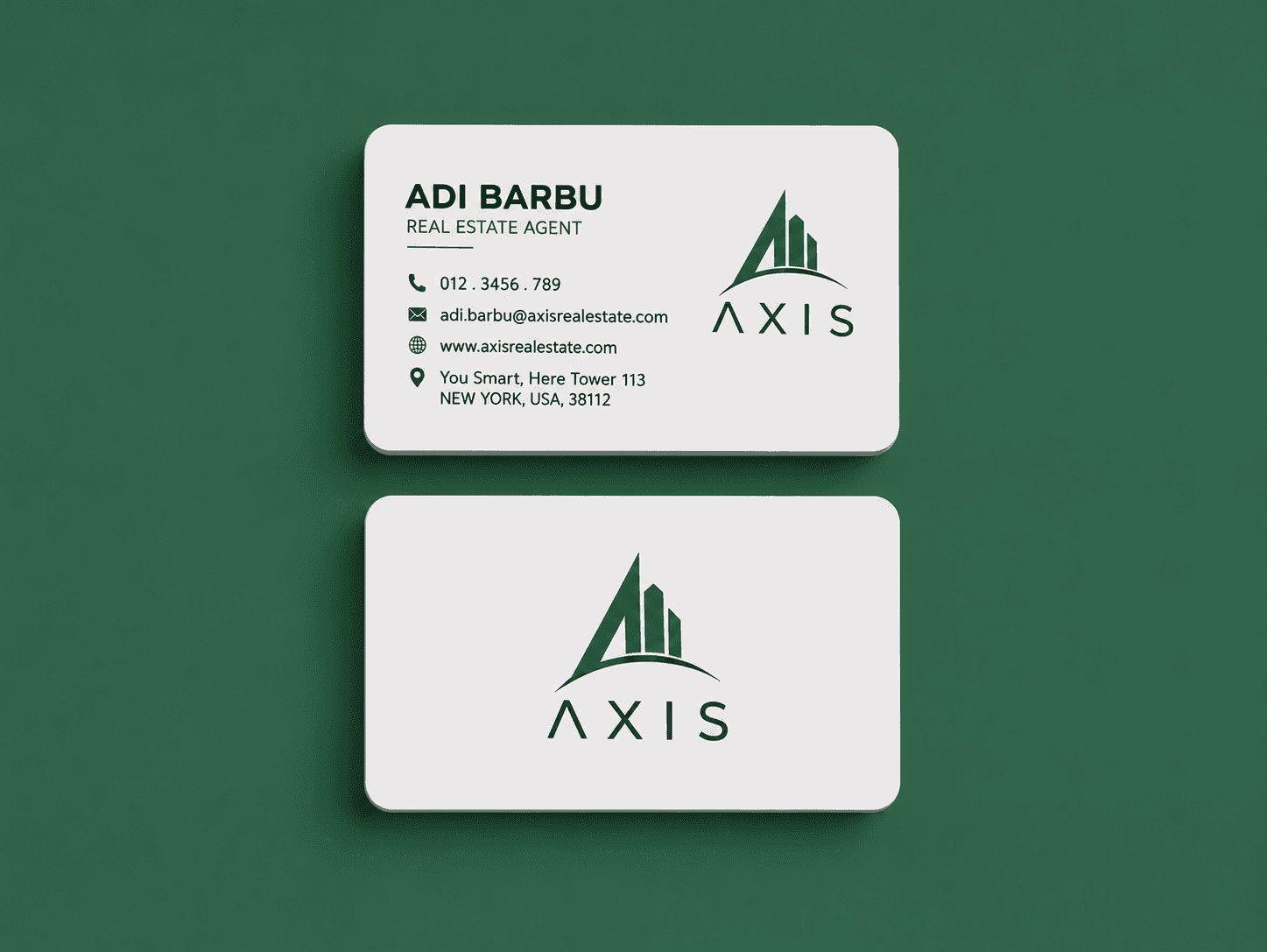
The system stays minimal, but gains depth through scale and placement






Color palette
A restrained palette, with contrast used only when it matters
Typography
Three distinct roles keep the voice clear across every touchpoint
Editorial clarity with restraint.
Comfortable paragraph rhythm gives the case study enough calm to explain decisions without making the page feel overlong.
Hierarchy
A system for sharper first impressions.
Case study excerpt
The identity works through quiet contrast, flat color, and a repeatable line motif that can scale from logo detail to full website section.
Caption / technical label
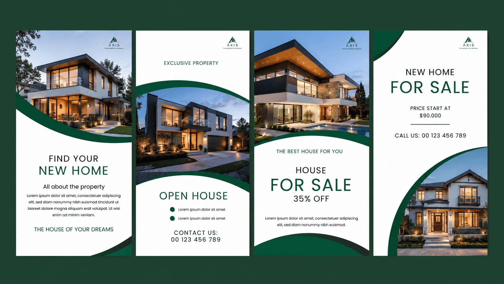
Secondary applications

Property Listing Post

Lead Generation

Brand Awareness

Product / website design
The identity becomes a working editorial website system.

Final outcome
The final system gave Axis a calmer, more confident way to be understood before the first conversation.
01
A clearer positioning story for premium founder-led work.
02
A reusable visual rhythm for services, essays, and case studies.
03