Brand Identity + Website Design
NOVA Identity System
A strategic brand identity and modern website crafted for a creative digital agency — designed to build trust, communicate expertise, and create a seamless experience across every client touchpoint.
Role
Brand Identity Designer, Web Designer
Timeline
Three-week sprint, concept to launch
Tools
Figma
Framer
Adobe CC

About the project
Nova helps businesses replace manual work with AI systems that actually hold up in production — chatbots, workflow automation, and integrations built to run quietly in the background. The brand needed to look like infrastructure, not a trend. Dark, precise, and confident enough to sit next to the tools it connects to.
Objective
Audience
Client problem
"We needed a cohesive identity that could build trust, communicate expertise, and scale with our growing agency."
Design challenge
Three tensions shaped the system from day one
01
Build Trust
Create a visual identity that feels modern and premium while remaining approachable and professional for businesses of all sizes.
02
Stand Out
Avoid generic agency trends and develop a distinctive identity that gives NOVA its own recognizable personality.
03
Stay Consistent
Design a flexible system that works seamlessly across the website, social media, presentations, and future brand touchpoints.
Design process
From positioning to interface, the work stayed deliberately sequential
01
Research
Studied how technical buyers evaluate automation tools — not through emotion, but through clarity, specificity, and proof of reliability.
02
Brand Strategy
04
Digital Presence
Applied the system to a product-style site — the kind a technical buyer would expect from a tool they're about to depend on.
05
Website Design
Adapted every section for smaller viewports without losing the density that makes the brand feel serious.
Primary design element
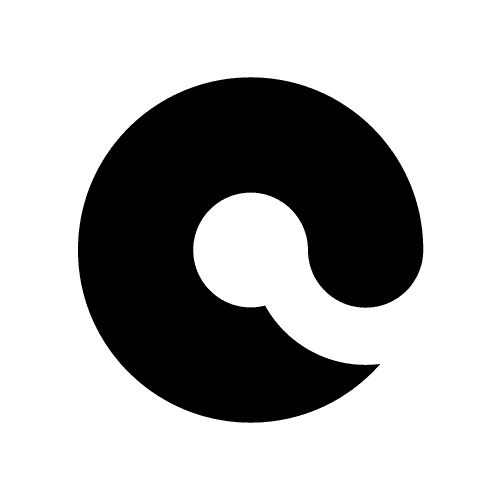
A logo built from a single, intentional motion


Construction logic
A mark built on a single motion
The Nova mark is a single continuous stroke that folds back on itself — one motion, no lift of the pen. It reads as a loop: work going in, automation happening, work coming out untouched by hand. Built on a strict geometric grid, it holds its shape at sixteen pixels and at building-scale signage alike.
System in context
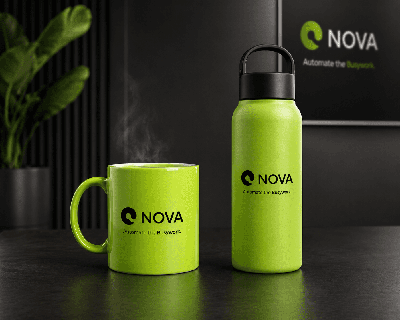
The identity stays sharp at any scale




Color palette
Typography
One typeface, disciplined use
Heading font - Inter Bold
Decentralized. Secure. Connected.
Body font - Regular
Comfortable paragraph rhythm keeps dense platform copy — rates, terms, security notices — legible without feeling like fine print.
Hierarchy
Earn and invest in crypto, all in one platform.
Platform UI excerpt
The identity works through quiet contrast, flat color, and a repeatable line motif that can scale from logo detail to full website section.
Typeface · technical label
Secondary applications

Agency Services

Our Process Headline

We're Hiring Headline
Product / website design
The identity becomes a working product site

Final outcome
A future-ready identity designed for clarity, consistency, and growth.
01
02
03